
Logo Design Tips for Creating a Memorable Brand
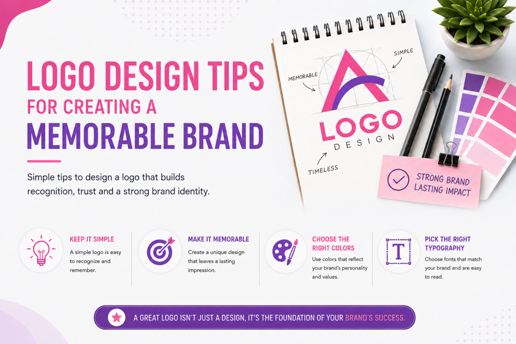
A logo is often the first thing people notice about a brand and usually the last thing they forget.
Think of the golden arches, a bitten apple, or a swoosh — you don’t need a company name to know who they belong to.That is the power of great logo design: instant recognition that comes from smart and thoughtful choices.
Whether you are creating a logo for a new business or updating an existing brand, these principles help distinguish ordinary logos from iconic ones.
Start With Simplicity
The most memorable logos are almost always the simplest ones.
A clean, uncluttered design is easier to recognize, remember, and reproduce across different surfaces — from a business card to a billboard.
Simplicity does not mean boring.
It means removing anything that doesn’t serve the core message.Ask yourself: if you could remove one more element, would the logo still work?If yes, remove it.
Make It Versatile
A great logo needs to work well in black and white as well as in full color.
It should look good when shrunk down to a small app icon and just as strong when displayed on a large storefront sign.
Before finalizing your design, test it:
- In grayscale
- At a small font size (like 16×16 pixels)
- On both dark and light backgrounds
- Printed in a single color
If it holds up in these situations, it is built to last.
Design for Relevance, Not Trends
Trendy design elements — like specific gradients or popular font pairs — can make a logo feel old-fashioned in just a few years.
Instead, focus on a design that reflects the brand’s core identity and values, something timeless rather than trendy.
That doesn’t mean logos should never change.
Many classic brands have gradually refined their logos over the years.The key is to refine, not to reinvent.
Choose Colours With Intention
Colour creates emotion and associations before people even see the shape of the logo.
Blue often communicates trust and stability, which is why it’s common in finance and tech.Red conveys energy and urgency, often used in food and retail.Green suggests growth, health, or sustainability.
Pick a color palette that reflects your brand’s personality and stick to one or two primary colors.
Complex color schemes are harder to reproduce and less memorable.
Typography Matters as Much as Imagery
If your logo includes text, the typeface you choose says as much about your brand as any icon.
A rounded, friendly font feels different from a sharp, geometric one — and both are different from a classic serif typeface.
Avoid default or overused fonts.
Consider custom lettering or slight adjustments to an existing typeface to create something unique and ownable.
Make It Distinct From Competitors
Look at what other brands in your industry are doing — then do something different.
It’s easy to fall into visual cliches, like using leaf icons for anything “eco-friendly” or globe icons for anything “global.” Standing apart from these patterns helps your brand appear unique, not just another option in a category.
Ensure Scalability Across Formats
Your logo will be used in many different contexts: websites, mobile apps, packaging, social media profile pictures, embroidered on merchandise, and printed on signs.
Design with all of these in mind from the start, rather than creating a beautiful logo that fails when resized or placed on an unexpected background.
Vector formats like SVG or AI files are essential here because they scale infinitely without losing quality.
Tell a Story, But Do Not Over-explain It
The best logos often have a story behind them — a hidden meaning, a clever visual play, or a nod to the brand’s origin.
This adds depth and gives your brand something interesting to share.However, the logo itself should not rely on that story to work.It needs to be visually effective first, and the story is a bonus for those who want to learn more.
Test It With Real People
Before you finalise your design, show it to people outside the design process — ideally people who are not already familiar with your brand.
Ask what they notice first, what associations come to mind, and whether it feels appropriate for the industry.Fresh eyes can spot problems that get invisible to those who look at the same file for weeks.
Build a System, Not Just a Symbol
A logo rarely exists on its own.
It needs a consistent system around it — approved colour variations, spacing rules, minimum sizing, and guidelines on how and how not to use it.Brands with strong logo systems maintain consistency across all touch points, which reinforces recognition over time.